Complete Story
04/27/2017
New logos selected for Ohio News Media Association, Foundation
By Jason Sanford, Manager of Communications and Content
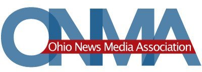
Two months after Ohio Newspaper Association members voted to change the organization’s name to the Ohio News Media Association, a new logo has been selected. The winning logo was designed by Malissa Vernon, Creative Director with the GateHouse Ohio Design Center.
The new logo retains the blue colors associated with the ONMA’s previous logo but updates the branding with a bright red slash and modern looking fonts.
In addition, Vernon also updated the logo for the Ohio News Media Foundation. The new foundation logo plays off the association’s logo while also being instantly identifiable as different. This is the first time the association and foundation logos were created to be complementary.
As the winner of the ONMA logo contest Vernon will receive a $200 first prize. The runner-up design was created by Josh Park with AdOhio. All logos submitted for the contest were evaluated by ONMA board members and staff alongside feedback from advertising, design and public relations agencies in the state. Many thanks to the people who shared feedback on the logos, including Susanne M. Brockman of Wyse Advertising, Jen Detwiler of Steiner Public Relations, Ann T. Gallagher of Gallagher Consulting Group, Jamie McGann of McGann Media Group, Helen Mumaw of The Ohlmann Group, and Jackie Reau of Game Day Communications.
About Malissa Vernon
Malissa Vernon had this to say about herself and her winning designs:
I've been a member of the graphic design community for over 15 years and in the newspaper world for seven. A graduate of Barton College (Wilson, NC), with degrees in Graphic Design, Ceramics and Criminal Justice and Criminology. I began as a designer with Alliance Publishing Company, moved on to Schurz Communications, then to Record Publishing Company where I took on the role of Creative Director of the Dix Design Center, now the GateHouse Ohio Design Center.
With this project, as with any new project, I start with the fonts. I'm a firm believer that the right font can change your mood, your mind, and maybe the world.
I prefer simple typefaces with clean lines and substantial widths. The juxtaposition of modern and classic fonts, combined with bold colors proves to be successful time and time again.


